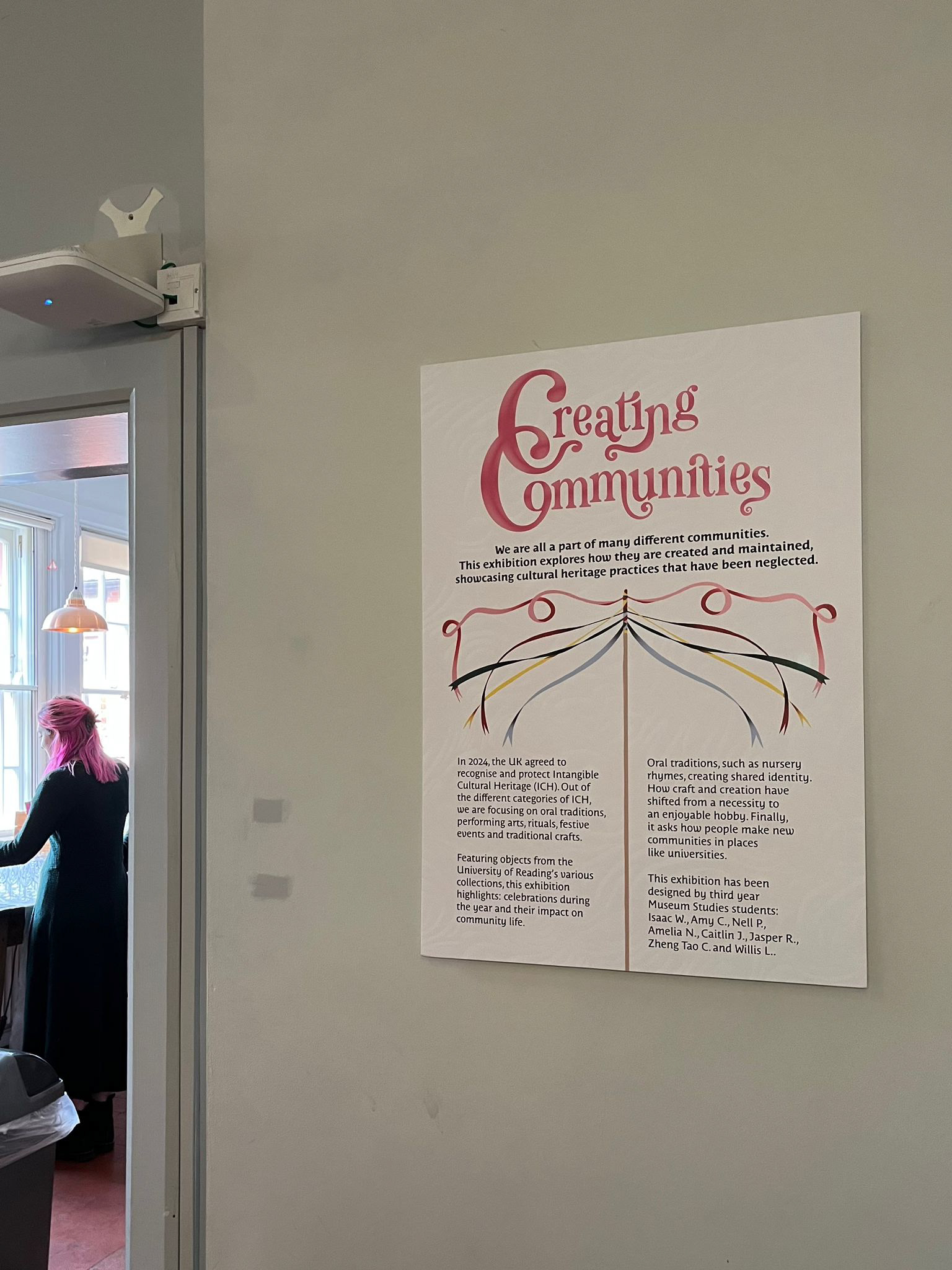
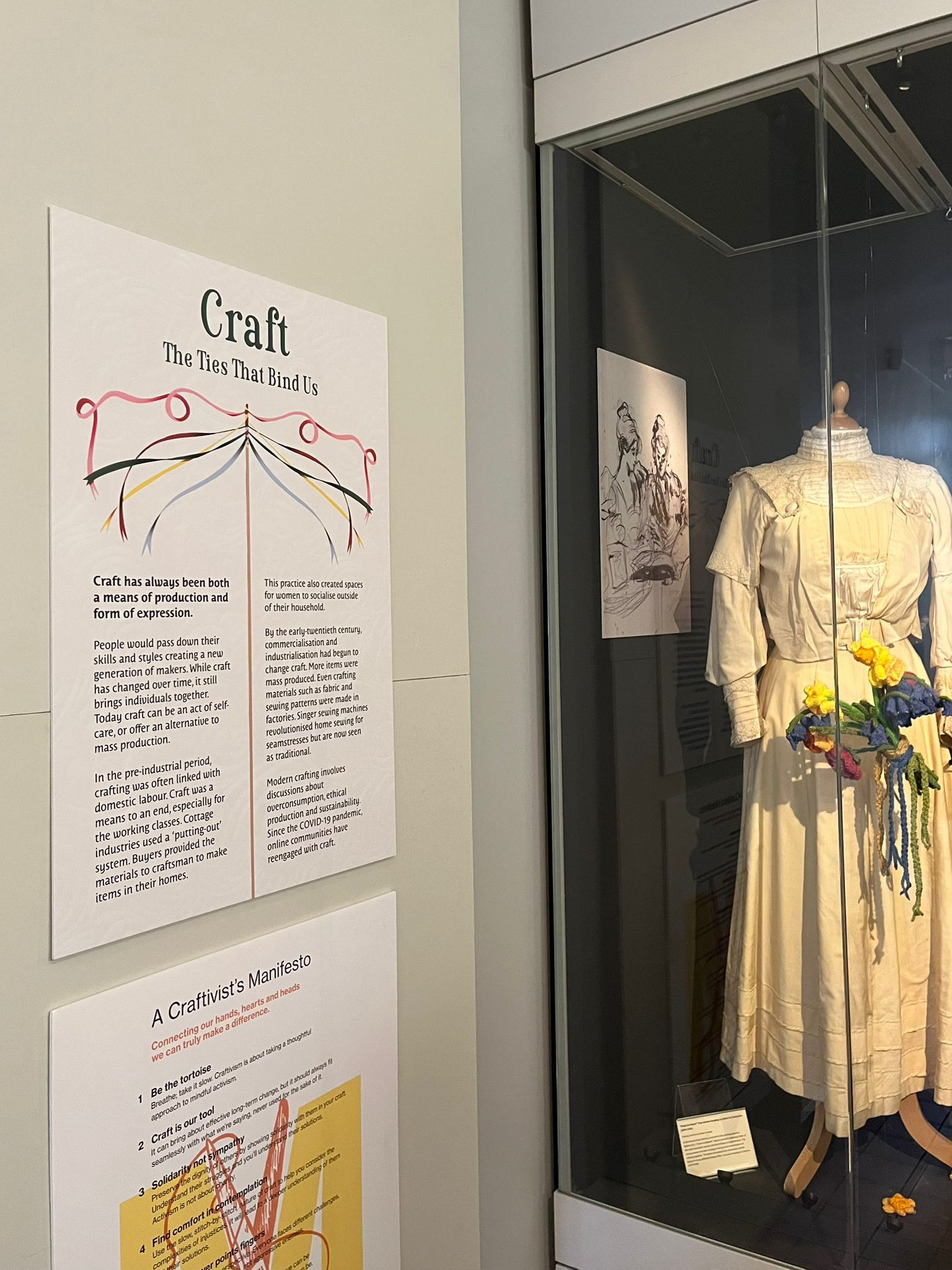
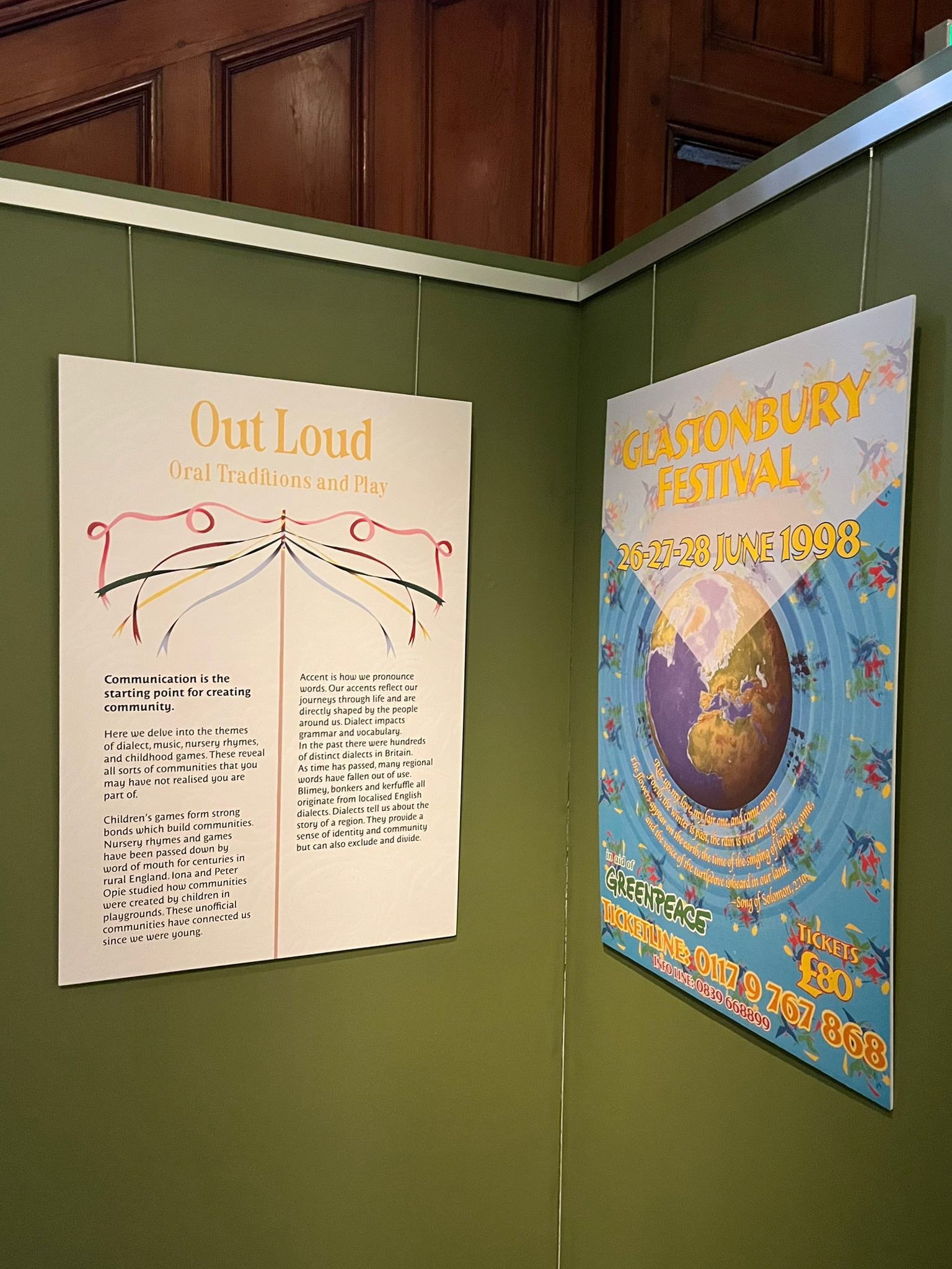
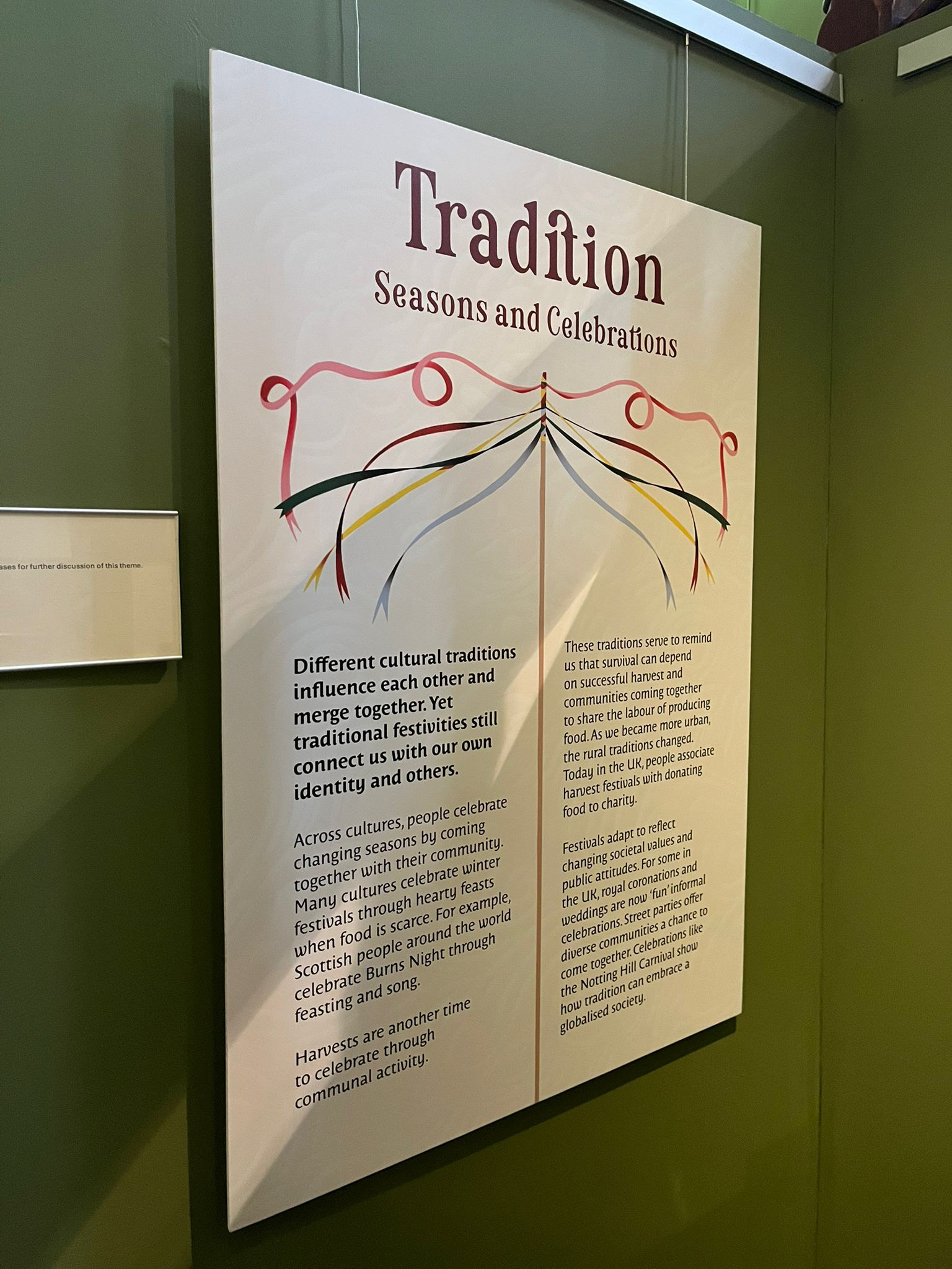
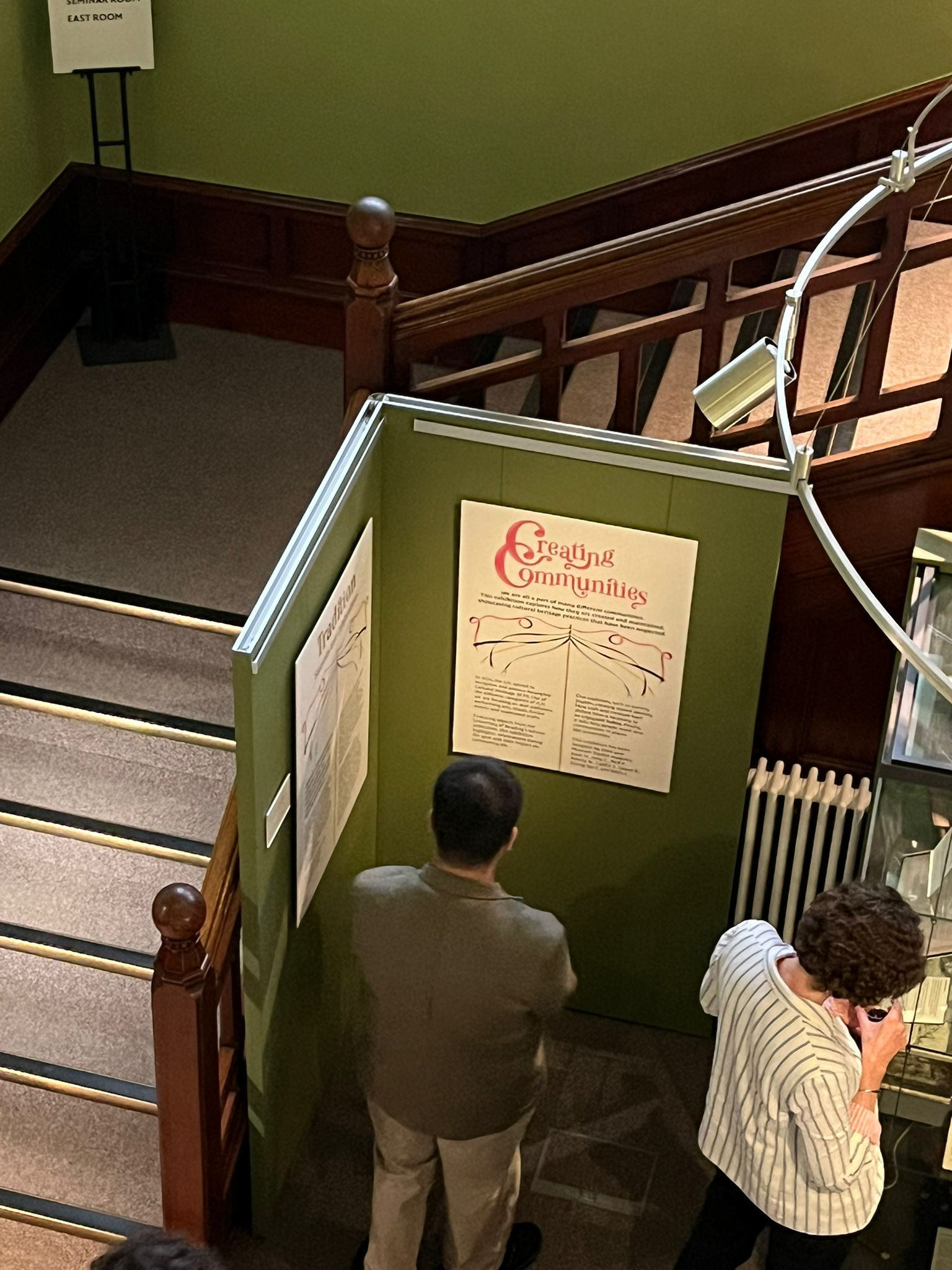
The brief for this project was to create five A1 panels for the 3rd Year Museum Studies students’ exhibition: Creating Communities. One panel would be used as an introduction to the exhibition, summarising its contents, whilst the other four panels would explain each separate section of the exhibition. In accordance with standard museum display practices, legibility of text and a clear reading experience was highlighted by the clients with importance. Another key goal for our design was to ensure the exhibition contents were effectively reflected.
Introductory panel
The clients expressed fondness towards the implementation of a maypole in our design, extending it further to ribbon motifs, as they felt these ideas encapsulated community best. In response to this, we created a maypole to use as the centerpiece of the panels and divider for the text. We also used typefaces with ribbon-like strokes for the headings and body text, as well as manipulating type to create the exhibition name wordmark with interwoven Cs and extended strokes. Additionally, we added a textured background with ribbon-like shapes.
The colours used for the maypole ribbons were based on a moodboard provided by the clients. To further extend the community motif, we allocated each panel heading one of these colours in abstract message of each panel being brought together by the maypole, in community of the exhibition.
Informative panel 1
Informative panel 2
Informative panel 3
Informative panel 4