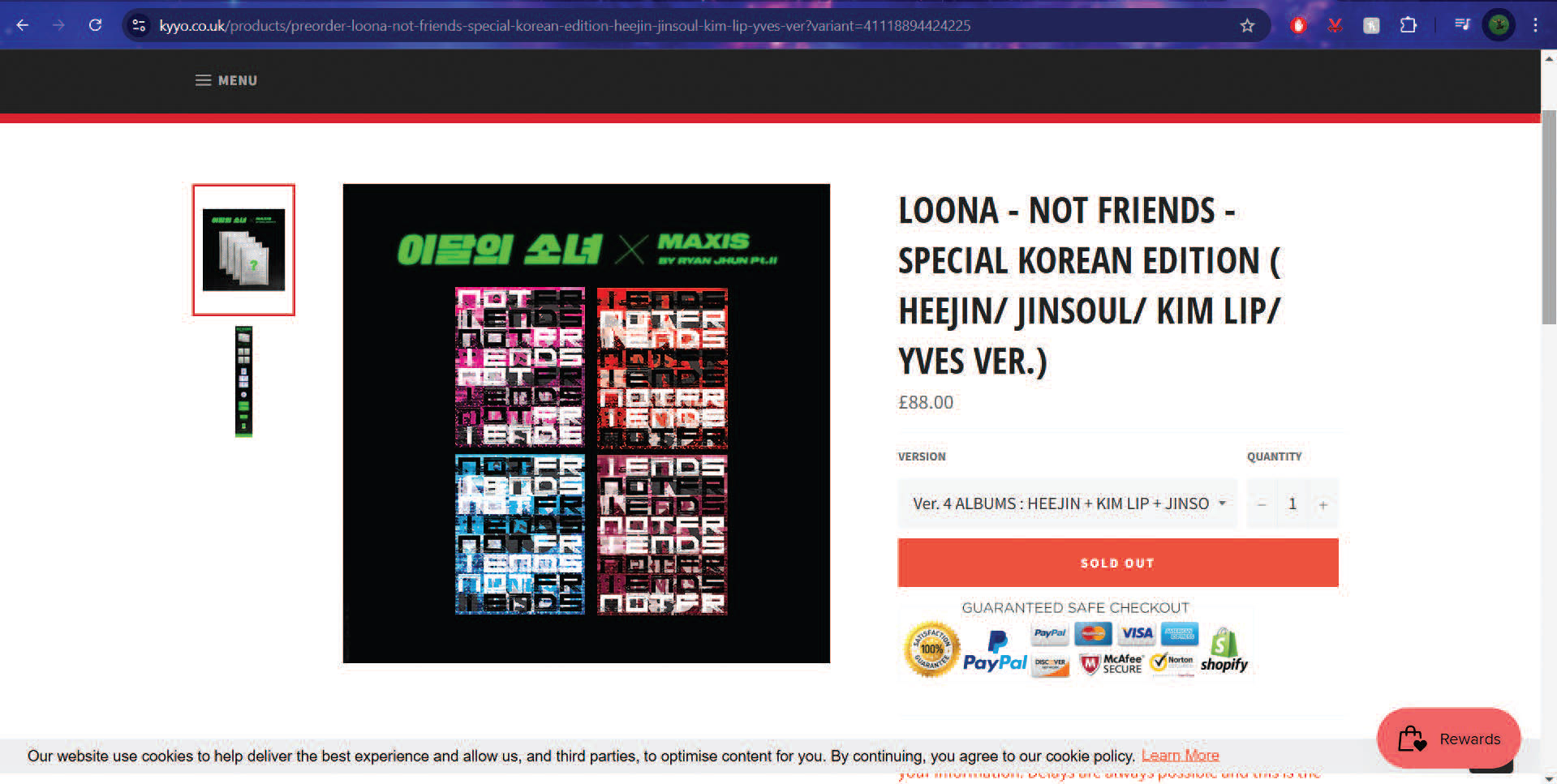
The brief made for this repackaging project was to redesign the album covers, photobook covers and photocard inclusions for the ‘Not Friends’ album set by the K-POP group, LOONA. Key goals for this brief were to encourage fans to buy all four album versions as a set and ensure a clear reflection of both the album’s music and group’s image through visual design.
Mock-up of repackaged set
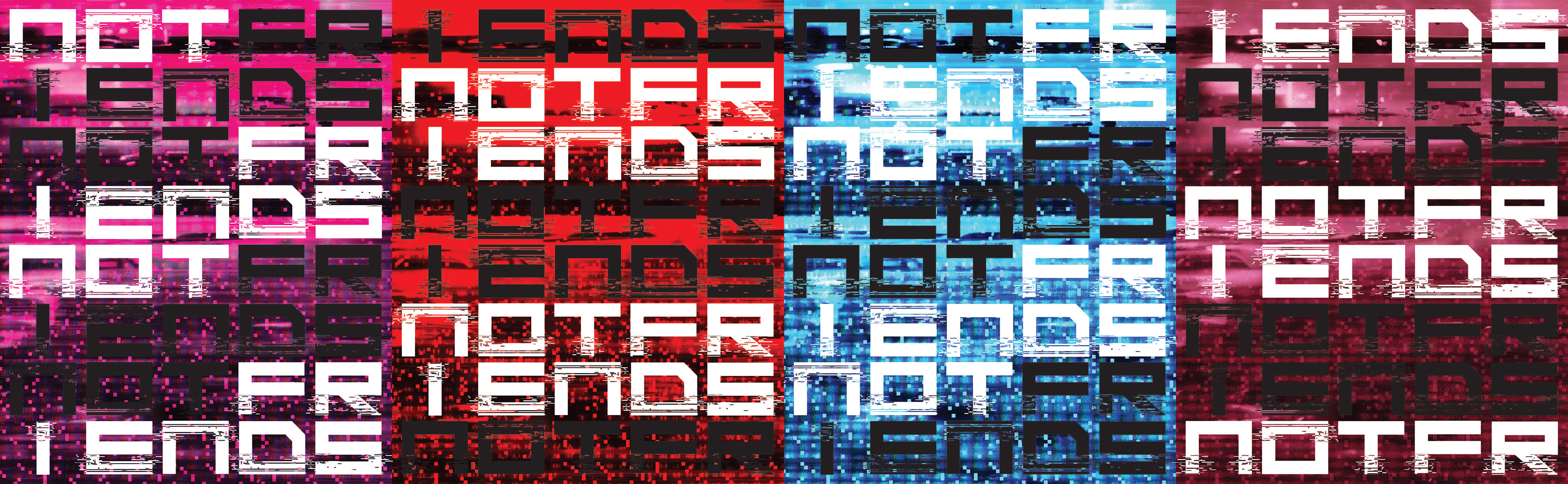
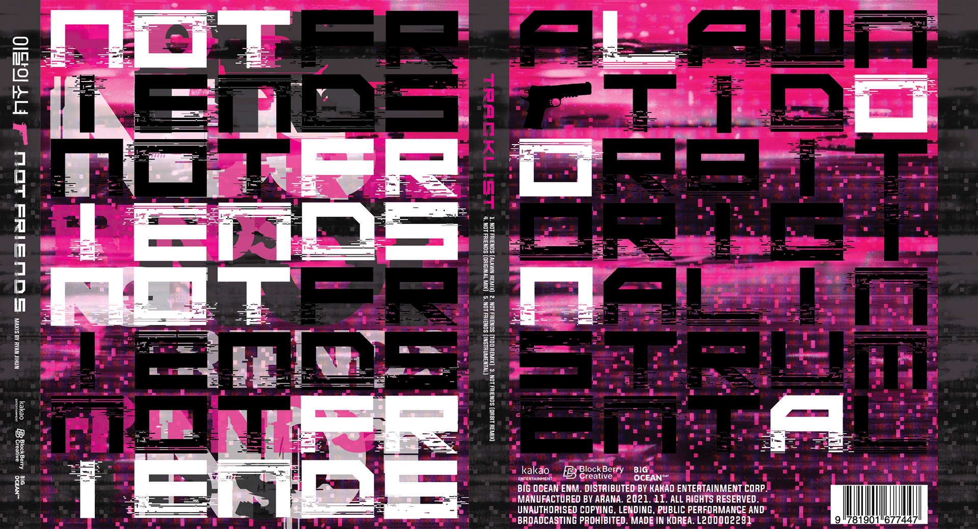
The concept for this album set was derived the words: Distorted and Layering, chosen as a reflection of the album’s music, a majority of the tracklist being remixes of one song. This was visually depicted through glitch elements, prominent in both typeface choice and backgrounds, specific layering and placement of text, and the coverage and highlighting of type, seen in all ouputs on the right.
A motif developed was what I labelled ‘Contained chaos’. On the front of the album cover, there is a structure that ‘contains’ the ‘chaos’ of the layered text: the visible grid made up of the album name’s letters. The letters layered behind the grid, also made up of the album name, use this grid for placement and sizing. This contained chaos is further developed in the photobook cover through the sudden contrast of covered letter rows on the outside cover with the revealed letter rows when opened on the inside; literal contained chaos.
The album set is made up of specific group member versions, reflected through design implementation of the members’ names and allocated colours. The gun motif seen throughout refers to the song’s music video, where there are many visuals of such.
Album sleeve

Photobook cover (outside)

Photocard inclusion (backside)

Photobook cover (inside)
The way each album cover highlights the album name differently, seen below, means that a continuous text design can be achieved to display the album name, using the grid, either through the full album set or pairings of any version. The design enables typographic linkage through either highlighted album name e.g. the pink and red covers, or the inversion of what is highlighted in white and what is kept black e.g. the pink and blue covers. This was done to achieve a unique series design feature to encourage set purchases, whilst still enabling individualism of each version, already establisbed by the different designated member version colours.